After a journey of growth spanning 27 years as Cadila Healthcare Ltd. and the Zydus Group, we have evolved and transformed ourselves in response to the changing times. Our legacy of over 70 years in healthcare and being dedicated to life in all its dimensions is reaffirmed in our new mission, vision and purpose. Unifying ourselves under the Zydus name, Cadila Healthcare Ltd., is renamed as Zydus Lifesciences Ltd.
Lorem ipsum dolor sit, amet consectetur adipisicing elit. Minus accusantium mollitia enim rerum doloremque, ipsa sed est at optio quam voluptatem eum earum vero assumenda temporibus eaque ut. Iure earum perspiciatis veritatis molestiae similique. Ipsum soluta sed quaerat necessitatibus. Dignissimos iure cumque exercitationem, autem reprehenderit ipsa doloremque voluptates id deleniti magnam necessitatibus architecto laborum dolore cupiditate dolorum nostrum ullam, voluptates iste molestias distinctio, dolor fugiat deserunt adipisci nulla dolorem, non aspernatur fuga soluta facere sit alias assumenda veritatis reprehenderit placeat ratione omnis. Autem, quos nisi. Saepe fugiat sunt, corporis perspiciatis ipsum eius nostrum.

The new logo is a stylized visualization of two hearts with ‘us’ at the core. Our brand colours are vibrant and rich in meaning. Emphasizing that everything we do is about ‘Us’. An inclusive community of employees, patients, caregivers, partners, customers, investors and stakeholders. The new ideology combines empathy and dynamism. This is brought to life through a new visual identity that delivers our future ready brand transformation. Positioning Zydus as a more path-breaking, inclusive, patient-centric, dynamic, global organization.

.jpg)
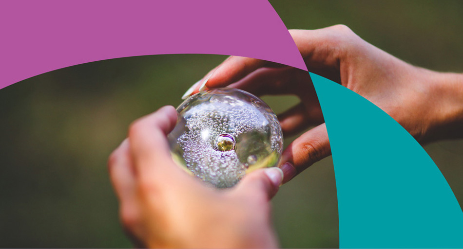
Teal expresses our dynamism and stands for our commitment to science. It is reflective of our aspiration to soar and achieve new ground, through pathbreaking discoveries and a commitment to innovation.
Purple symbolizes our purposefulness and stands for our dedication to care and nurturance. It is reflective of our patient-centric approach, our desire to serve unmet healthcare needs with empathy.

Our commitment to care and patient centricity comes alive with the gentle and rounded curves contrasting with confident edges of Baloo. It is distinctive and contemporary that perfectly embraces the new brand narrative.
For an organisation that creates solutions through empathy and pathbreaking discoveries, Exo brings about the balance perfectly. A contemporary sans serif typeface with geometric cues, Exo exemplifies the values of future forward innovations.


In 1995 we dedicated ourselves to the welfare of people and depicted our commitment with a heart-to-heart portrait. Today, with our evolved brand identity, this commitment emerges stronger than ever. The two hearts coming together emphasise that everything we do is inclusive and about ‘Us’.
Our community of employees, patients, caregivers, partners, customers, investors, stakeholders are an integral part of our growth story. They are the reason why we exist.